Sunday, 7 August 2011

HYPERKIT

A reference to one of the websites Aaron was looking at during the last meeting - Hyperkit from London who really achieve the lo-fi exhibition design style we have been discussing - with the use of trestle tables, shelving & modular systems.


(P.S. I totally dig the look of the ENAMEL ALPHABET signage)

I think the Hyperkit references also show how simply the design of the exhibition and the identity can interact with eachother - which is what seems to have made the past shows more or less successful - esp. with Design Republic, where the concept of the show was reflected throughout the design of the space - from printed material to maps to signage and installations.

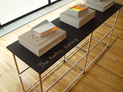
I think this is completely achievable for us - especially is it was simply a matter of commissioning the construction of a number of plywood made systems such as the following.... (which are other collected references from around the interweb...


(Above is the Central St Martins Grad Show from last year)


I do realise that a lot of these are displaying small printed books etc. and won't apply to all of the UTS students but I think the concepts can apply for us and be designed in a way that works for all - or we can find modular systems that can be bought. 


NAMES ?


Hey Guys,

Here's one of the references I flicked up quickly last week - an invite and design from the RCA last year - I kind of love the intricacy of how they've approached the graphic and think it's something to consider - a common element I notice with a lot of the UTS shows in the past is that they seem to have one Hero Image and nothing that really follows through after that - the one that did actually achieve a more dynamic approach was the Republic of Design that had quite a few varied elements all working together... Anyway, what immediately popped into my brain looking at this was using students names to create part of the graphics somehow?

Something that could translate onto the space interestingly - like this.... Where each space highlights where you are - or a wayfinding reference for locating students? Too complicated?


However, ultimately what I think is special about this is the beautiful finish and how it's been approached as a design piece itself - not just a print out with an exhibition logo on the front.

T

Saturday, 6 August 2011

Point of View

Hi Guys,

I found this link for an exhibition that plays with typography to create an identity. I also like the concept "Point of View" which relates to us as graduates who've come to understand their style and views on design, yet the viewer will see it from their own perspective/own light. However i'm not sure we can paint walls but lightening might be possible..
http://www.behance.net/gallery/Anamorphic-Typography/1091883

Jo

Friday, 5 August 2011

UTS DSGN08

Billy Blue Graduate Exhibition 2009 'Ex'


I'm sure a lot of you have already seen this on September Industry's January feature on Australian designer Magdalena Czarnecki, but she was part of the team that put together what looks like an amazing identiy and promotional campaign for the Billy Blue Grad Show in '09.

I really love her use of stacking in the photography of the posters. I think we should steer clear of a type-driven identity personally but this is just some food for thought.

"The biggest graduate exhibition in Billy Blue history needed to be big – literally. The Exhibition was about big ideas, expanding out from existing spaces and exploring new grounds. Ex- was used as a running theme throughout the design process and applied to the collateral material, such as Ex-panding, Ex-student Ex-hibiting and so on."


Republic of Design (Design '09)


I've been looking at some of the photos from past shows ('07, '08, '09, '10) and in my opinion Republic of Design is the standout for the level of attention to detail.

Some of the design outcomes I noticed are:
  • Large hanging vinyl signage
  • 'Republic of Design' map wall sculptures
  • Specially considered VIP section design
  • VIP & Designer lanyards
  • Hanging 'Paper Planes' above stairwell
  • Vinyl stair-signage way-finding for fashion
  • Altered application of identity design for fashion show projections
  • Series of viral-style teasers
  • Mannequin covers for opening night
At the end of the meeting on 03-08-11 I know we discussed the idea of an identity which incorporated interlocking shapes. The design team for '09 has had the same concept, only they have applied it to interlocking 'territories'.


Tuesday, 2 August 2011

Aesop Store Displays


The main points I drew from our last meeting was that the grad show needed to be simple, temporary, effective for display purposes and not costly. Immediately I think of the amazing installations setup in Aesop stores. What makes these designs even more unique, is the way they use recyclable materials to convey a concept and a experience. Displays such as “think outside the box” which used hundreds of brown boxes to stack and contain its products. Or the 1800 copies of the New York Times, used to emphasis Aesop’s “…respect for the written word and the history of each city with which it engages” (Aesop, Press Materials 2011). All of which are simple but effective for display purposes, transforming a space and capturing the attention of the viewers.

 Check out these links....

BOX DESIGN
http://www.thecoolhunter.co.uk/stores/AESOP----Skin-Care-That-Thinks-Outside-The-Box/

NEW YORK TIMES DESIGN
http://www.fastcodesign.com/1664581/a-kiosk-made-of-more-than-1000-newspapers